


We Thought We Had Seen It All, But Data Proved It Could Be More........


So week 1 came with its demands and we thought that we had seen the climax of the stress and pressure the Side Hustle Bootcamp promised. Oh, dear! How ‘wronger’ could we have been? Week 2 literally subsided all the morale and high spirits that made us initial sheer noisemakers on the various Bootcamp platforms.
THE TASK
The task this time around was to “work on a Health/Disease Insight Analysis. Which could be any two of the following diseases; Covid-19, Hepatitis, Malaria, Lassa fever, Cholera, or HIV/AIDs. We were to scrap, clean, and visualize data using Power BI and create a Disease and Infection Monitoring Dashboard.
The dashboard must show these data: Infected Demographic by Sex Infected Demographic by age range Reported cases by date Affected locations heatmap Mortality by type Mortality by region Mortality by sex Mortality by age range Mortality rate Total death”
THE PROCESS
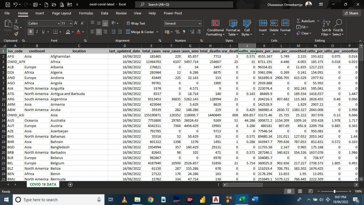
We quickly started—researching, which I suppose is a core value every Data Analyst should have—and we obtained differing datasets from the internet in the process. At this moment, we had to meet so we could brainstorm on which dataset best fits and why.
‘The process long no be here.’ Having to find matching datasets. Ensuring the source is genuine. Sampling for need-analysis, etc. Alas! We agreed on these:
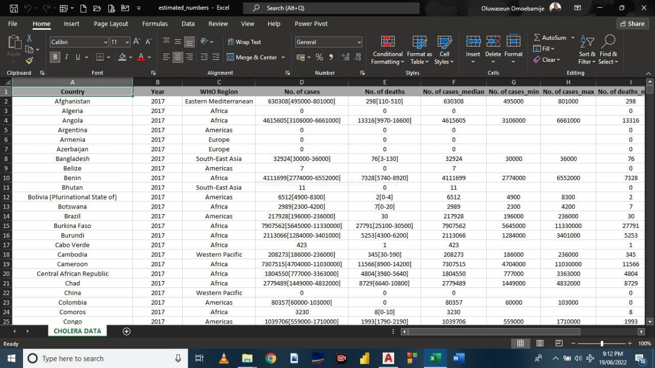
Then comes the cleaning process (on Microsoft Excel). We had to remove redundant columns and details that would complicate our intended dashboard.
Upon cleaning and transforming the datasets, they looked much better and more relatable as could be seen here:
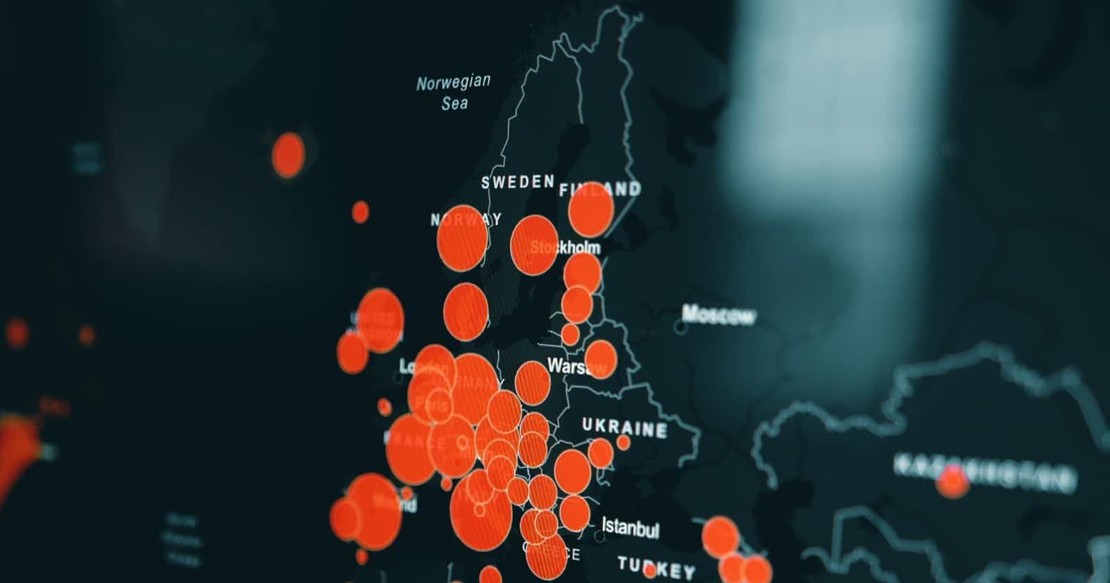
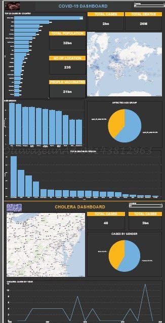
Now, these were mere frivolities, the biggest headache laid waiting at the point of merging two unrelated datasets into one beautiful dashboard. But yes, as difficult as that seemed initially, after a thoughtful process and lookout at other concepts, we eventually agreed to make do with just a Pie Chart, Column Chart, Line Trend, and Map in visualizing the core information we intend to pass; and that very part birthed this beauty you see right here:
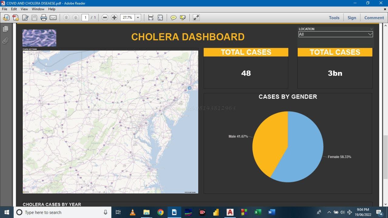
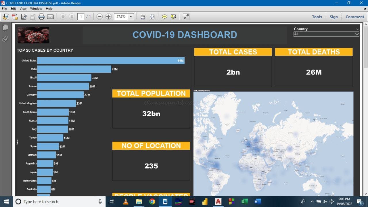
With just a button click, you can access the infection rates across all the countries in the world, and that is an amazing strength in simplicity. Yet again, against all odds, the portfolio_data_analytics_team_2 came through.
Our dearest reader, we definitely cannot but share the trends of this journey with you. The Side Hustle Bootcamp experience has been nothing shy of wonders and first-hand reality of the many ineffable encounters one could have handling data, but it is all the more intriguing remembering that we have four more weeks of bringing magnificent designs and data analytical tips to your fingertips.
We hope you stay glued to our channel so you donʼt miss out on subsequent updates.
Thank you for reading through, and do accept our warmest regards.